
You’ll Never Get Too Much Credit for all you do.
Dear Typography
What is Dear Typography?
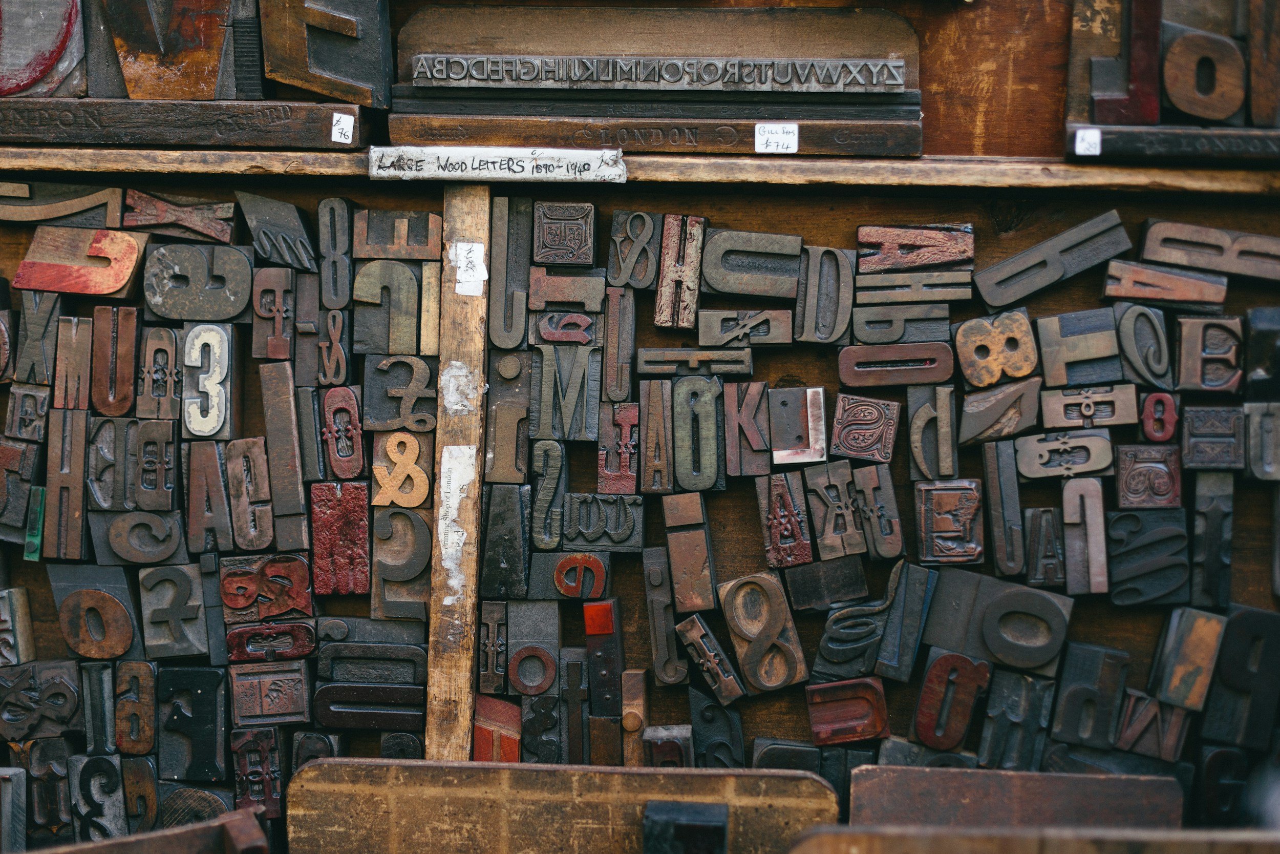
Dear Typography is a guidebook I created for designers who work with type. Typography is everywhere — and the details matter more than most people realize. Small caps, old style figures, kerning, ligatures — these subtle choices dramatically affect how people experience a design. This book shares the ideas, tips, and information I wish I'd had earlier in my career.

Why should you care about Typography?
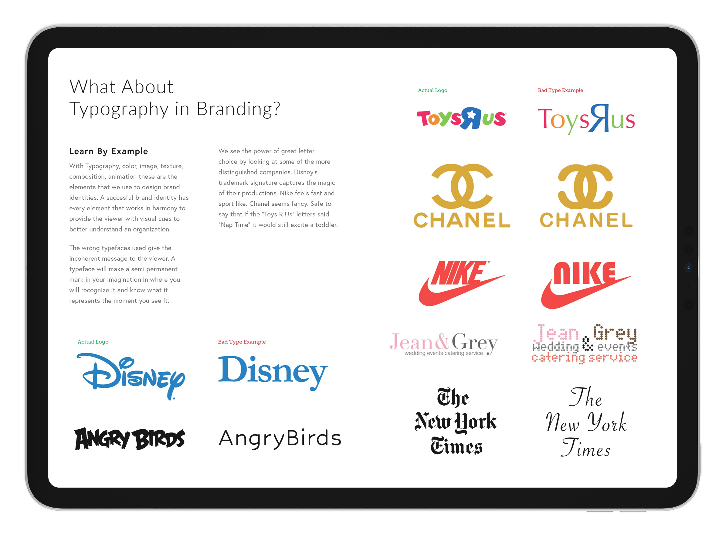
Typography is as much a part of a brand's identity as its logo or color palette. The right typeface communicates personality, builds trust, and shapes how people feel about what they're reading — before they've even processed the words.

Reflect Harmony & Professionalism
Ligatures are one of those details that separate good typography from great typography. Dear Typography covers how to enable and use them across design programs — giving designers the tools to bring more harmony and polish to everything they create.
Make it or break it.
Typeface selection can make or break a design. The wrong choice undermines credibility. The right one reinforces everything a brand stands for — instantly and without a word.


edMints
edMints was a self-promotional project I designed to introduce myself as a freelance designer — and to make a case for typography at the same time. A custom tin packed with type cards, typography stickers, and my business card. A tangible expression of my appreciation for good type.